IHTFree is an inheritance tax consultancy, offering advice to minimise the burden of inheritance tax to their clients. They were a new startup when they came to me, and the brief was for branding to stand out from an extremely conservative crowd, then develop a website and printed materials to move into this marketplace. I took a look at the marketplace, and there was a great sea of dark blue booklets with gold leaf lettering, conservative, serif fonts, usually with a coat of arms featuring somewhere. Seriously old school, and very “old boy network”.
I worked closely with the client, and we decided to take a fresh approach to directly counter the prevalent themes in the market, with a blue-sky, natural theme:
- the logo was a leaf progressively aging
- the imagery was focussed on 3 generations of a family, clearly corresponding to the logo
- the overall theme was fresh and white
- fonts were all sans-serif
- a light, airy, easy to read feel was created for the whole site
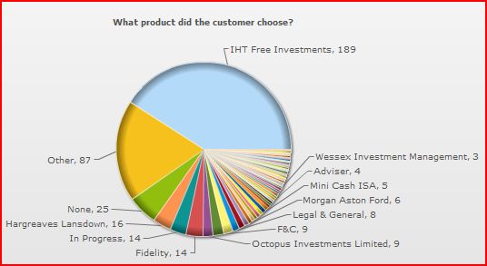
The proof of concept came with an ad campaign on the Sunday Times money section website – the results of the approach speak for themselves, where click-through rates for our ads were many times the nearest competitor.
The results were extraordinary. The client had a tiger by the tail in this scenario – and they simply didn’t have the agents to follow up on all the leads. It took a while for new agents to be brought on board, so the full advantage of this initial impact couldn’t be fully realised. Nevertheless, I think this is a great example of how players in a marketplace can all be wrong, and a fresh approach will disrupt what is established, in an example of common sense as much as creativity!
IHTFree has since been sold and rebranded, but the success that facilitated this was absolutely down to the design approach.


